ggplot(chic, aes(x = season, y = o3)) +
  geom_boxplot(fill = "indianred") +
  labs(x = "Season", y = "Ozone") +
  coord_flip()
It is incredibly easy to flip a plot on its side. Here I have added the coord_flip() which is all you need to flip the plot. This makes most sense when using geom’s to represent categorical data, for example bar charts or, as in the following example, box and whiskers plots:
ggplot(chic, aes(x = season, y = o3)) +
geom_boxplot(fill = "indianred") +
labs(x = "Season", y = "Ozone") +
coord_flip()
orientation = "y"
Since {ggplot2} version 3.0.0 it is also possible to draw geom’s horizontally via the argument orientation = "y". Expand to see example.
ggplot(chic, aes(x = o3, y = season)) +
  geom_boxplot(fill = "indianred", orientation = "y") +
  labs(x = "Ozone", y = "Season")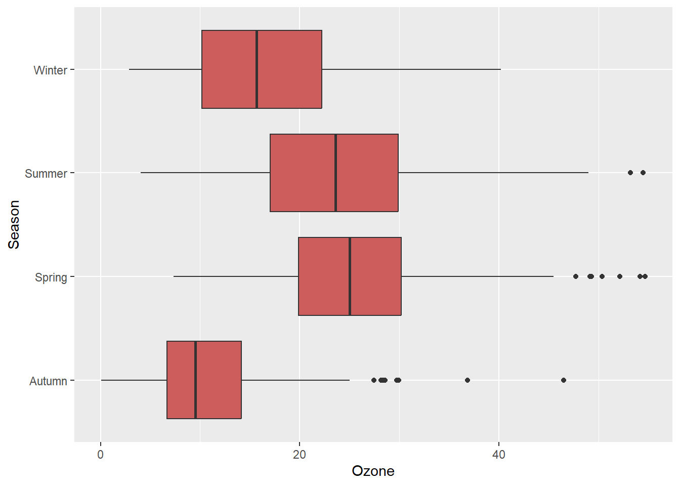
One can fix the aspect ratio of the Cartesian coordinate system and literally force a physical representation of the units along the x and y axes:
ggplot(chic, aes(x = temp, y = o3)) +
  geom_point() +
  labs(x = "Temperature (°F)", y = "Ozone Level") +
  scale_x_continuous(breaks = seq(0, 80, by = 20)) +
  coord_fixed(ratio = 1)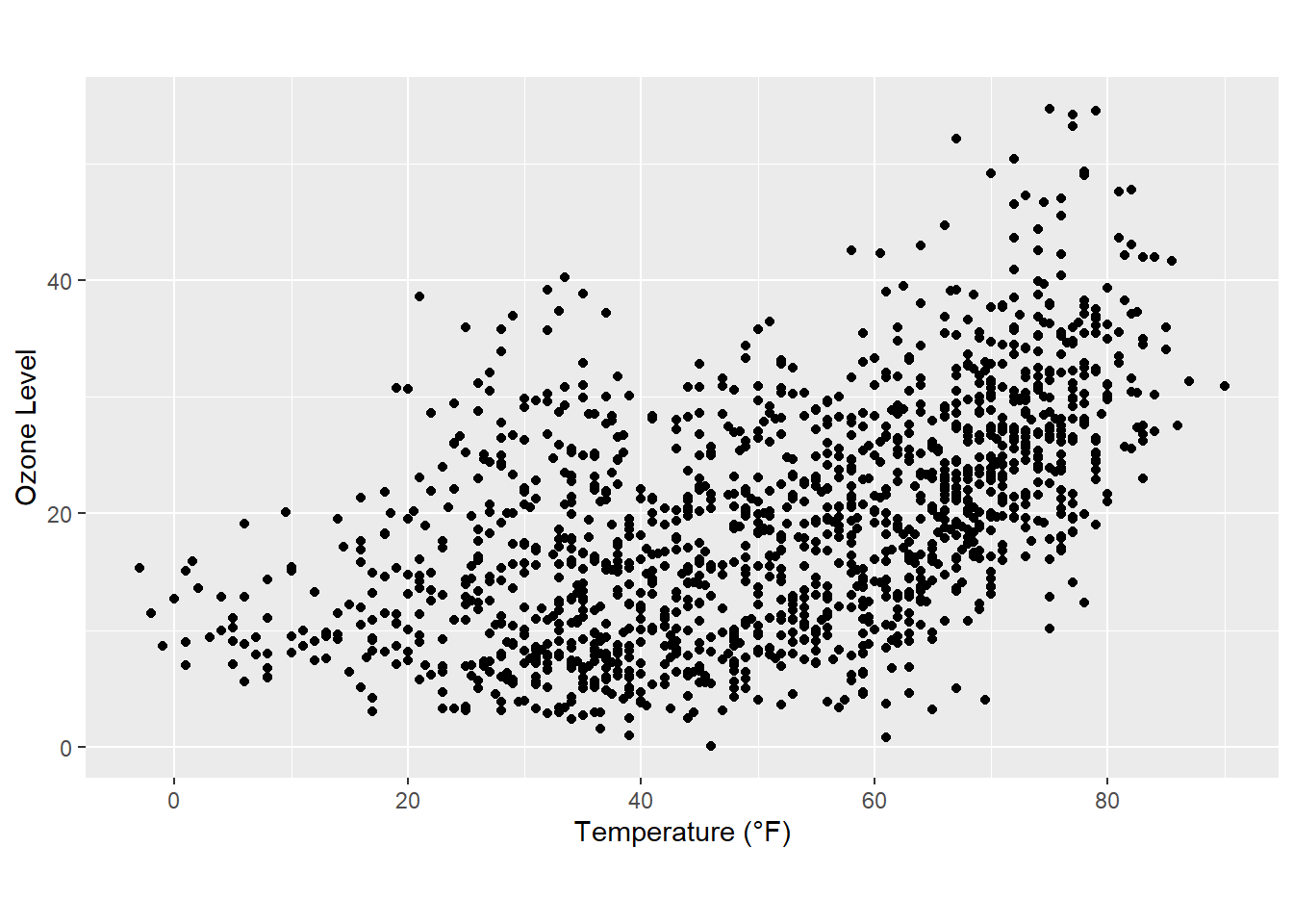
This way one can ensure not only a fixed step length on the axes but also that the exported plot looks as expected. However, your saved plot likely contains a lot of white space in case you do not use a suitable aspect ratio:
ggplot(chic, aes(x = temp, y = o3)) +
  geom_point() +
  labs(x = "Temperature (°F)", y = "Ozone Level") +
  scale_x_continuous(breaks = seq(0, 80, by = 20)) +
  coord_fixed(ratio = 1/3) +
  theme(plot.background = element_rect(fill = "grey80"))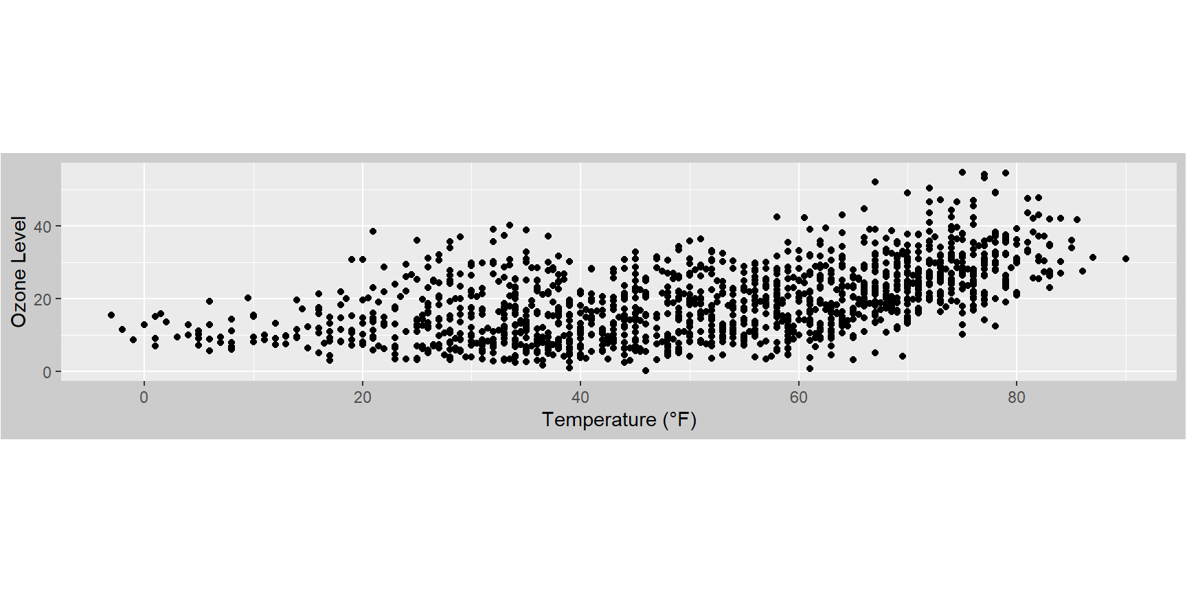
You can also easily reverse an axis using scale_x_reverse() or scale_y_reverse(), respectively:
ggplot(chic, aes(x = date, y = temp, color = o3)) +
  geom_point() +
  labs(x = "Year", y = "Temperature (°F)") +
  scale_y_reverse()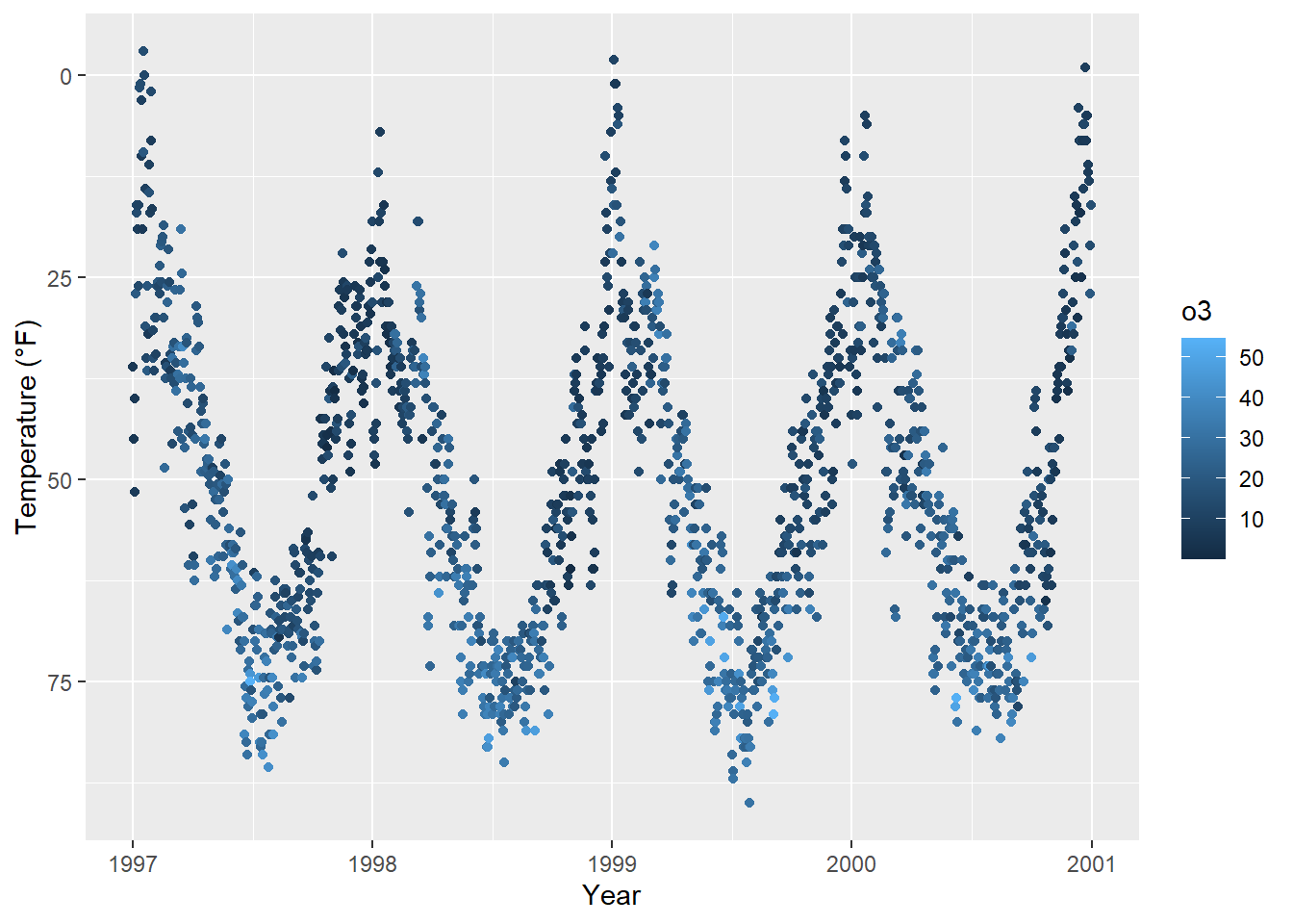
Note that this will only work for continuous data. If you want to reverse discrete data, use the fct_rev() function from the {forcats} package. Expand to see example.
## the default
ggplot(chic, aes(x = temp, y = season)) +
  geom_jitter(aes(color = season), show.legend = FALSE) +
  labs(x = "Temperature (°F)", y = NULL)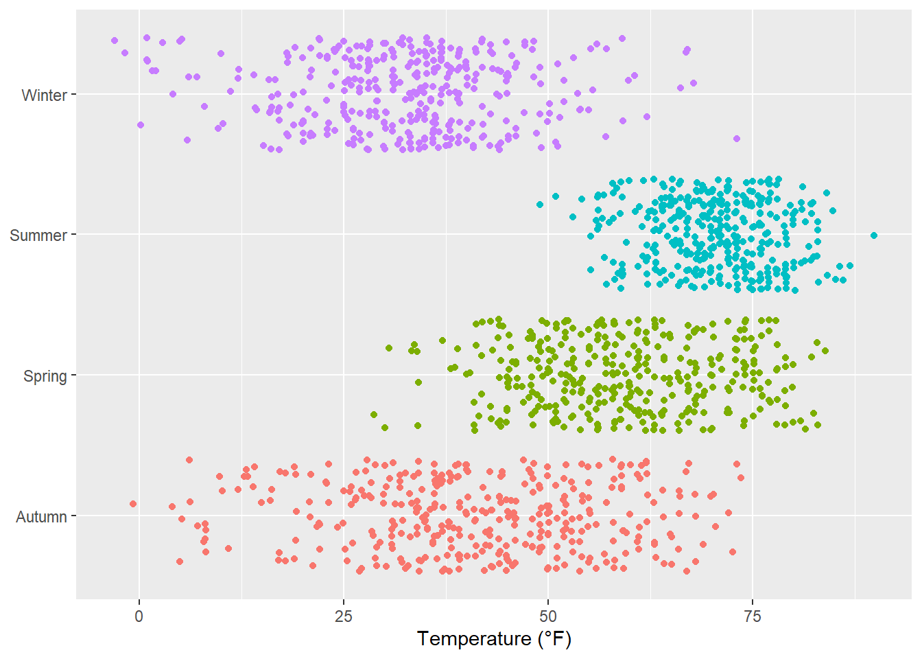
library(forcats)
set.seed(10)
ggplot(chic, aes(x = temp, y = fct_rev(season))) +
  geom_jitter(aes(color = season), show.legend = FALSE) +
  labs(x = "Temperature (°F)", y = NULL)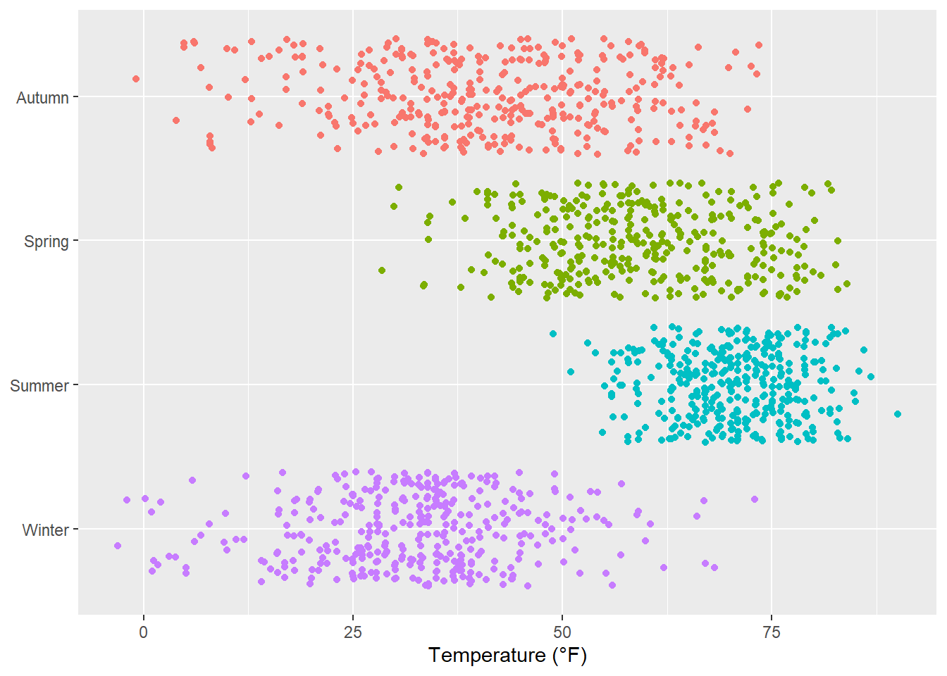
… or transform the default linear mapping by using scale_y_log10() or scale_y_sqrt(). As an example, here is a log10-transformed axis (which introduces NA’s in this case so be careful):
ggplot(chic, aes(x = date, y = temp, color = o3)) +
  geom_point() +
  labs(x = "Year", y = "Temperature (°F)") +
  scale_y_log10(lim = c(0.1, 100))
Warning in transformation$transform(x): NaNs producedWarning in scale_y_log10(lim = c(0.1, 100)): log-10 transformation introduced
infinite values.Warning: Removed 3 rows containing missing values or values outside the scale range
(`geom_point()`).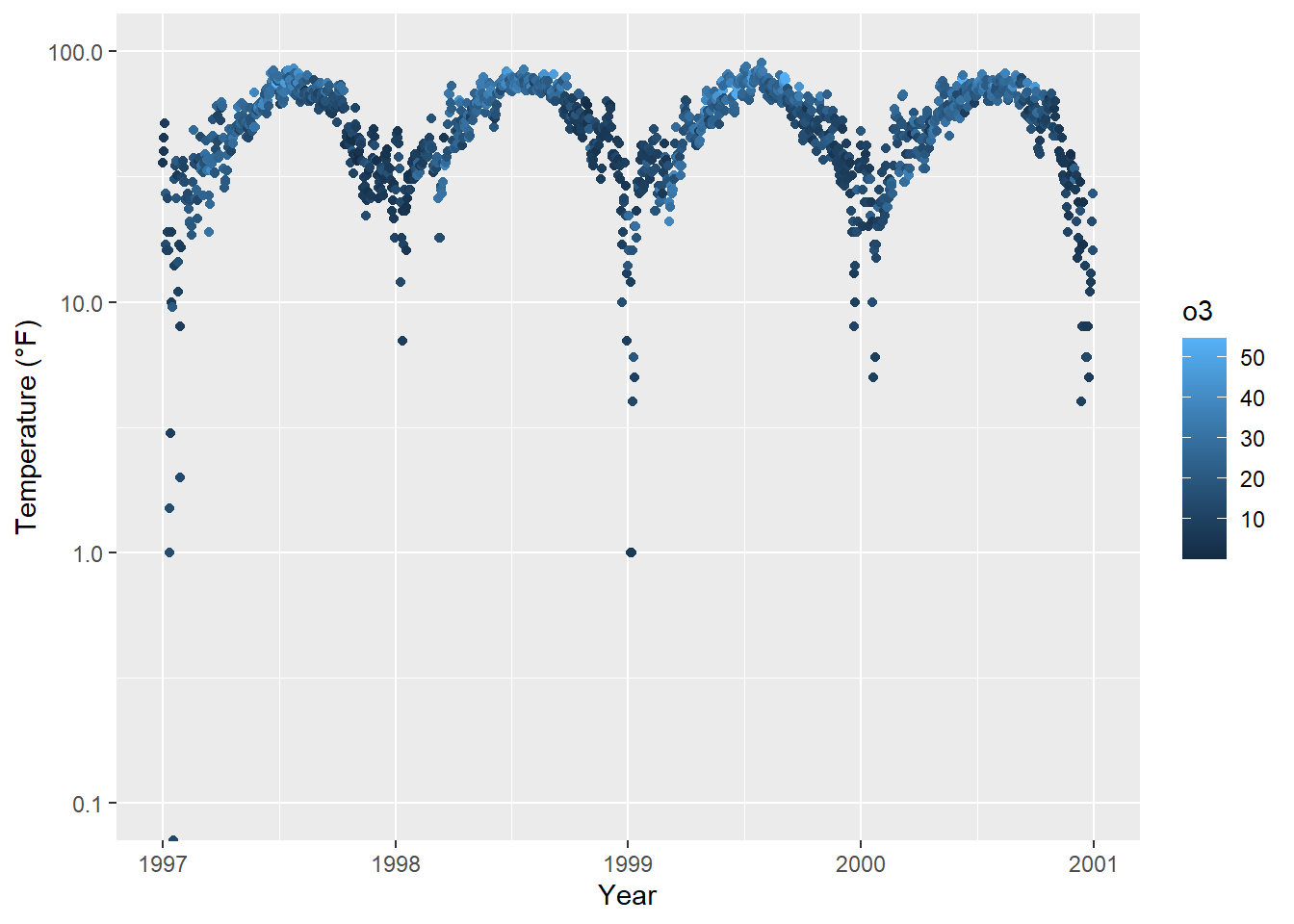
It is also possible to circularize (polarize?) the coordinate system by calling coord_polar().
chic |>
  dplyr::group_by(season) |>
  dplyr::summarize(o3 = median(o3)) |>
  ggplot(aes(x = season, y = o3)) +
    geom_col(aes(fill = season), color = NA) +
    labs(x = "", y = "Median Ozone Level") +
    coord_polar() +
    guides(fill = "none")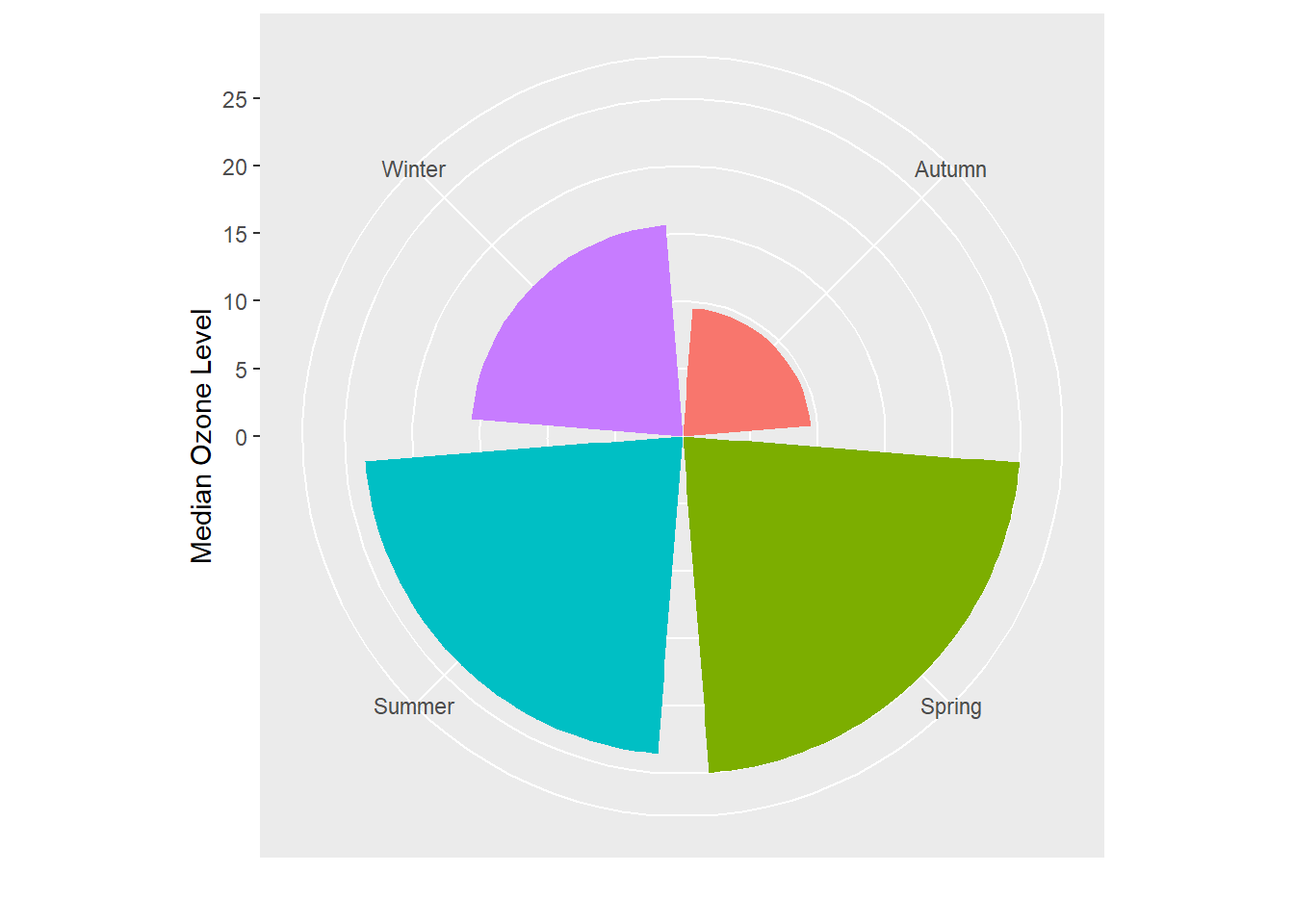
This coordinate system allows to draw pie charts as well:
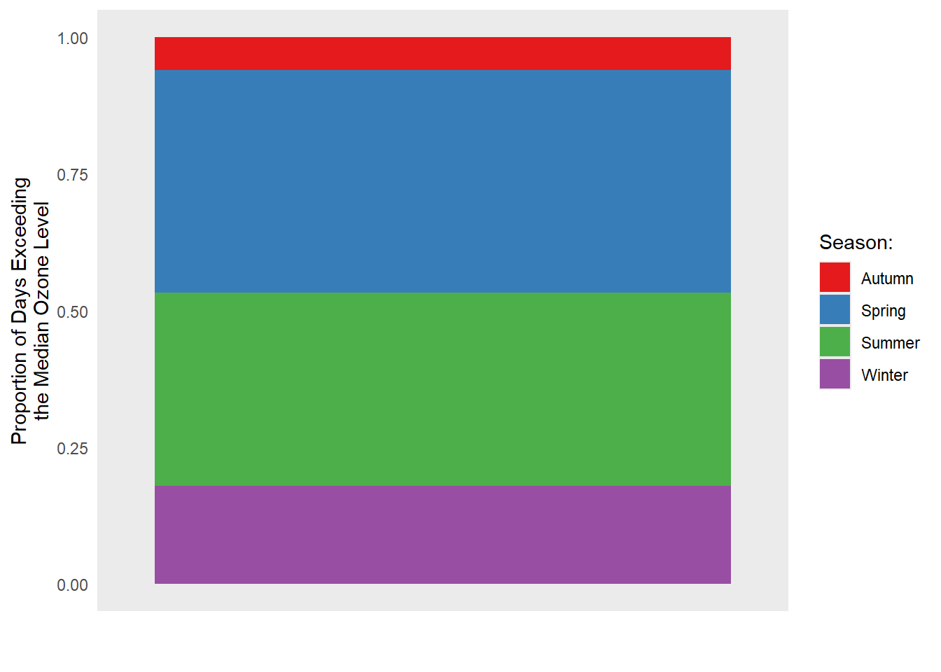
chic_sum <-
  chic |>
  dplyr::mutate(o3_avg = median(o3)) |>
  dplyr::filter(o3 > o3_avg) |>
  dplyr::mutate(n_all = n()) |>
  dplyr::group_by(season) |>
  dplyr::summarize(rel = n() / unique(n_all))

ggplot(chic_sum, aes(x = "", y = rel)) +
  geom_col(aes(fill = season), width = 1, color = NA) +
  labs(x = "", y = "Proportion of Days Exceeding\nthe Median Ozone Level") +
  coord_polar(theta = "y") +
  scale_fill_brewer(palette = "Set1", name = "Season:") +
  theme(axis.ticks = element_blank(),
        panel.grid = element_blank())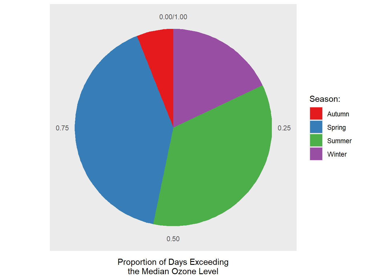
I suggest to always look also at the outcome of the same code in a Cartesian coordinate system, which is the default, to understand the logic behind coord_polar() and theta:
ggplot(chic_sum, aes(x = "", y = rel)) +
  geom_col(aes(fill = season), width = 1, color = NA) +
  labs(x = "", y = "Proportion of Days Exceeding\nthe Median Ozone Level") +
  #coord_polar(theta = "y") +
  scale_fill_brewer(palette = "Set1", name = "Season:") +
  theme(axis.ticks = element_blank(),
        panel.grid = element_blank())