library(shiny)
runExample("01_hello")18 Working with Interactive Plots
The following collection lists libraries that can be used in combination with {ggplot2} or on their own to create interactive visualizations in R (often making use of existing JavaScript libraries).
18.1 Combination of {ggplot2} and {shiny}
{shiny} is a package from RStudio that makes it incredibly easy to build interactive web applications with R. For an introduction and live examples, visit the Shiny homepage.
To look at the potential use, you can check out the Hello Shiny examples. This is the first one:
Of course, one can use ggplots in these apps. This example demonstrates the possibility to add some interactive user experience:
runExample("04_mpg")18.2 Plot.ly via {plotly} and {ggplot2}
Plot.ly is a tool for creating online, interactive graphics and web apps. The {plotly} package enables you to create those directly from your {ggplot2} plots and the workflow is surprisingly easy and can be done from within R. However, some of your theme settings might be changed and need to be modified manually afterwards. Also, and unfortunately, it is not straightforward to create facets or true multi-panel plots that scale nicely.
g <- ggplot(chic, aes(date, temp)) +
  geom_line(color = "grey") +
  geom_point(aes(color = season)) +
  scale_color_brewer(palette = "Dark2", guide = "none") +
  labs(x = NULL, y = "Temperature (°F)") +
  theme_bw()

g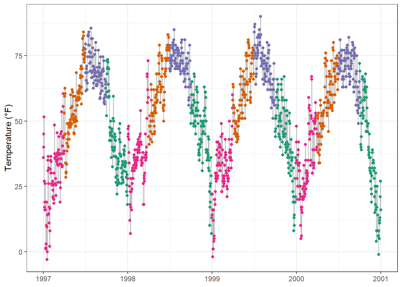
library(plotly)

ggplotly(g)
Here, for example, it keeps the overall theme setting but adds the legend again.
18.3 ggiraph and ggplot2
{ggiraph} is an R package that allows you to create dynamic {ggplot2} graphs. This allows you to add tooltips, animations and JavaScript actions to the graphics. The package also allows the selection of graphical elements when used in Shiny applications.
library(ggiraph)

g <- ggplot(chic, aes(date, temp)) +
  geom_line(color = "grey") +
  geom_point_interactive(
    aes(color = season, tooltip = season, data_id = season)
  ) +
  scale_color_brewer(palette = "Dark2", guide = "none") +
  labs(x = NULL, y = "Temperature (°F)") +
  theme_bw()

girafe(ggobj = g)
18.4 Highcharts via {highcharter}
Highcharts, a software library for interactive charting, is another visualization library written in pure JavaScript that has been ported to R. The package {highcharter} makes it possible to use them—but be aware that Highcharts is only free in case of non-commercial use.
library(highcharter)Registered S3 method overwritten by 'quantmod':
method from
as.zoo.data.frame zoo hchart(chic, "scatter", hcaes(x = date, y = temp, group = season))18.5 Echarts via {echarts4r}
Apache ECharts is a free, powerful charting and visualization library offering an easy way of building intuitive, interactive, and highly customizable charts. Even though it is written in pure JavaScript, one can use it in R via the {echarts4r} library thanks to John Coene. Check out the impressive example gallery or this app made by the package developer John Coene.
library(echarts4r)

chic |>
  e_charts(date) |>
  e_scatter(temp, symbol_size = 7) |>
  e_visual_map(temp) |>
  e_y_axis(name = "Temperature (°F)") |>
  e_legend(FALSE)
18.6 Chart.js via {charter}
charter is another package developed by John Coene that enables the use of a JavaScript visualization library in R. The package allows you to build interactive plots with the help of the Charts.js framework.
library(charter)

chic$date_num <- as.numeric(chic$date)
## doesn't work with class date

chart(data = chic, caes(date_num, temp)) |>
  c_scatter(caes(color = season, group = season)) |>
  c_colors(RColorBrewer::brewer.pal(4, name = "Dark2"))
18.7 Bokeh via {rbokeh}
{rbokeh} is an R package that allows you to create interactive visualizations using the Bokeh library. It is a powerful tool for creating interactive plots and adding interactivity to your visualizations. The following example demonstrates how to create an interactive scatter plot using {rbokeh}. You can find more examples and documentation on the rbokeh website.
library(rbokeh)
p <- figure() %>%
  ly_points(Sepal.Length, Sepal.Width, data = iris,
    color = Species, glyph = Species,
    hover = list(Sepal.Length, Sepal.Width))
p
18.8 Advanced Interactive plots using CanvasExpress
CanvasXpress is a JavaScript library that allows you to create interactive visualizations. The package {canvasXpress} for R enables the creation of interactive plots directly from R. It is a powerful tool for creating visualizations and adding interactivity to your plots. The following example demonstrates how to create a bar-line graph using CanvasXpress. You can find more examples and documentation on the CanvasXpress website.
library(canvasXpress)
y=read.table("https://www.canvasxpress.org/data/cX-generic-dat.txt", header=TRUE, sep="\t", quote="", row.names=1, fill=TRUE, check.names=FALSE, stringsAsFactors=FALSE)
x=read.table("https://www.canvasxpress.org/data/cX-generic-smp.txt", header=TRUE, sep="\t", quote="", row.names=1, fill=TRUE, check.names=FALSE, stringsAsFactors=FALSE)
z=read.table("https://www.canvasxpress.org/data/cX-generic-var.txt", header=TRUE, sep="\t", quote="", row.names=1, fill=TRUE, check.names=FALSE, stringsAsFactors=FALSE)
canvasXpress(
  data=y,
  smpAnnot=x,
  varAnnot=z,
  graphOrientation="vertical",
  graphType="BarLine",
  legendColumns=2,
  legendPosition="bottom",
  lineThickness=2,
  lineType="spline",
  showTransition=FALSE,
  smpLabelRotate=45,
  smpTitle="Collection of Samples",
  subtitle="Random Data",
  theme="CanvasXpress",
  title="Bar-Line Graphs",
  xAxis=list("V1", "V2"),
  xAxis2=list("V3", "V4"),
  xAxis2TickFormat="%.0f T",
  xAxisTickFormat="%.0f M"
)
18.9 Dygraphs via {dygraphs}
{dygraphs} is an R package that allows you to create interactive time series plots. It is based on the JavaScript library Dygraphs.
library(dygraphs)
lungDeaths <- cbind(mdeaths, fdeaths)
dygraph(lungDeaths)
And there are many more options to create interactive plots in R. The choice of the right library depends on the specific requirements of your project and the desired level of interactivity. The examples above should give you a good starting point to explore the possibilities of interactive plots in R. We’ll add more examples in the future.