ggplot(chic, aes(x = date, y = temp)) +
  geom_point(color = "#1D8565", size = 2) +
  labs(x = "Year", y = "Temperature (°F)") +
  theme(panel.background = element_rect(
    fill = "#64D2AA", color = "#64D2AA", linewidth = 2)
  )
To modify the overall appearance of your plot, you can use various functions. While altering the entire theme of your plot is one option (covered in detail in the “Working with Themes” section below), you can also make specific changes to individual elements such as backgrounds and grid lines.
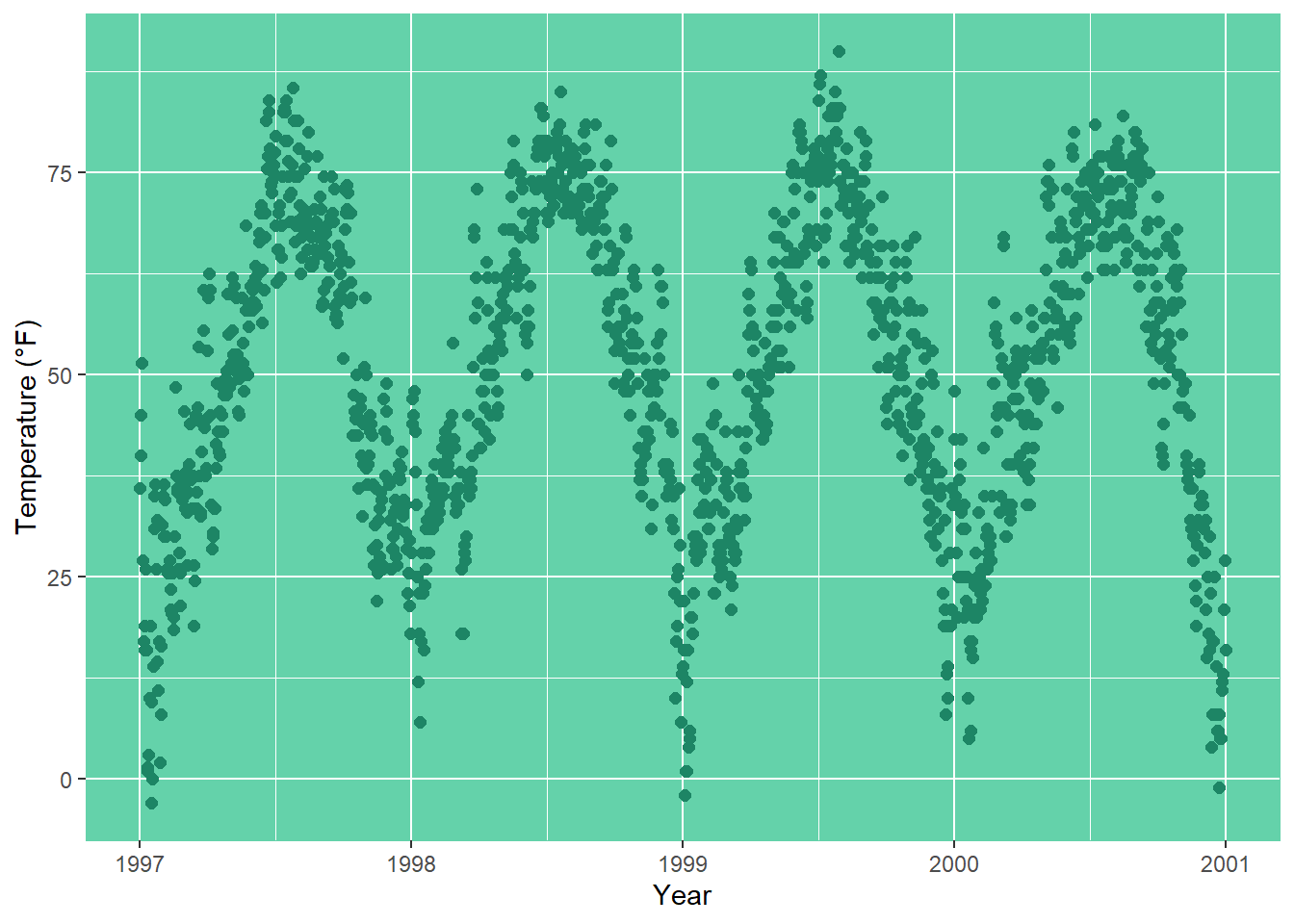
You can adjust the background color (fill) of the panel area (where the data is plotted) by modifying the theme element panel.background:
ggplot(chic, aes(x = date, y = temp)) +
geom_point(color = "#1D8565", size = 2) +
labs(x = "Year", y = "Temperature (°F)") +
theme(panel.background = element_rect(
fill = "#64D2AA", color = "#64D2AA", linewidth = 2)
)
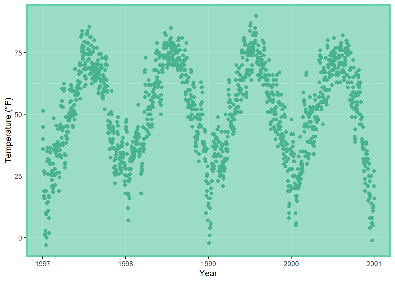
Keep in mind that the true color — the outline of the panel background — didn’t change despite our specification. This is because there’s a layer on top of panel.background, namely panel.border. However, it’s important to use a transparent fill here; otherwise, your data will be hidden behind this layer. In the following example, I illustrate this by using a semitransparent hex color for the fill argument in element_rect:
ggplot(chic, aes(x = date, y = temp)) +
  geom_point(color = "#1D8565", size = 2) +
  labs(x = "Year", y = "Temperature (°F)") +
  theme(panel.border = element_rect(
    fill = "#64D2AA99", color = "#64D2AA", linewidth = 2)
  )
There are two types of grid lines: major grid lines indicating the ticks and minor grid lines between the major ones. You can customize both by overwriting the defaults for panel.grid or for each set of gridlines separately, panel.grid.major and panel.grid.minor.
ggplot(chic, aes(x = date, y = temp)) +
  geom_point(color = "firebrick") +
  labs(x = "Year", y = "Temperature (°F)") +
  theme(panel.grid.major = element_line(color = "gray10", linewidth = .5),
        panel.grid.minor = element_line(color = "gray70", linewidth = .25))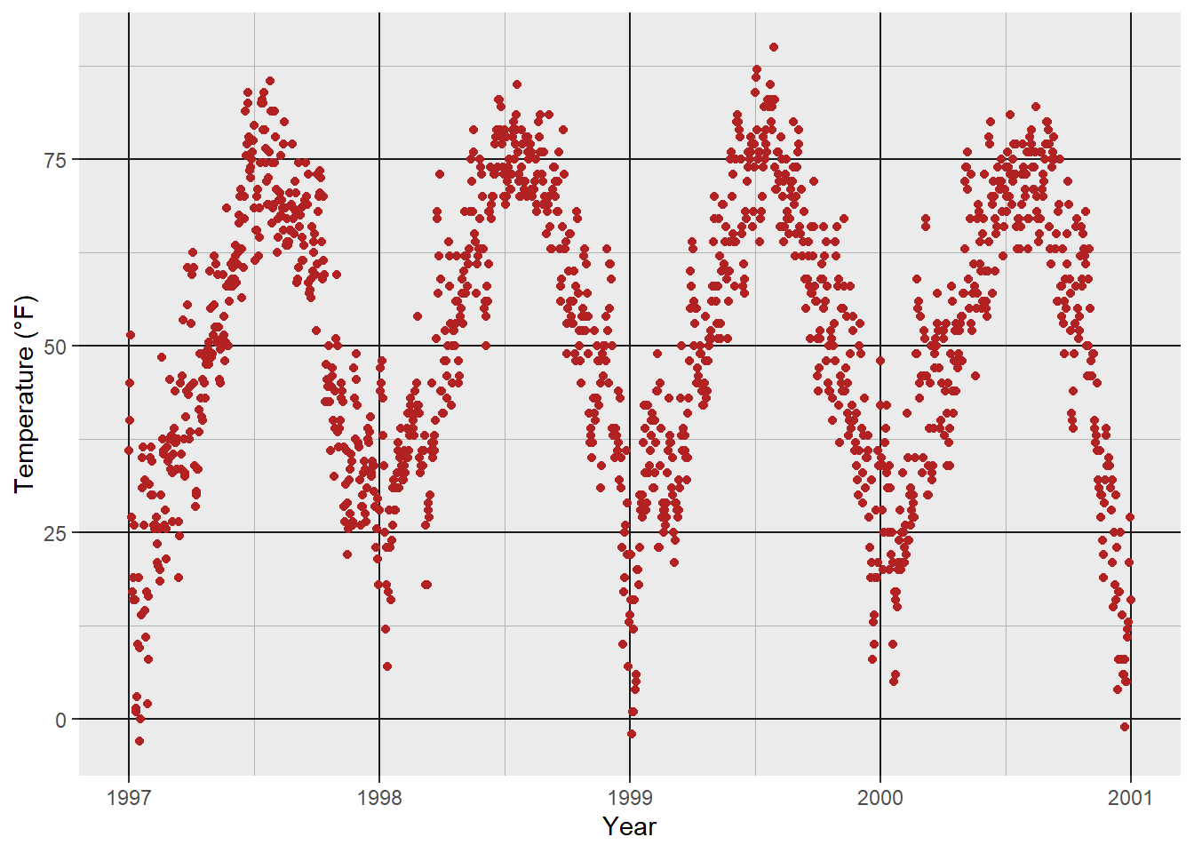
You can even specify settings for all four different levels of grid lines: major horizontal, major vertical, minor horizontal, and minor vertical.
ggplot(chic, aes(x = date, y = temp)) +
  geom_point(color = "firebrick") +
  labs(x = "Year", y = "Temperature (°F)") +
  theme(panel.grid.major = element_line(linewidth = .5, linetype = "dashed"),
        panel.grid.minor = element_line(linewidth = .25, linetype = "dotted"),
        panel.grid.major.x = element_line(color = "red1"),
        panel.grid.major.y = element_line(color = "blue1"),
        panel.grid.minor.x = element_line(color = "red4"),
        panel.grid.minor.y = element_line(color = "blue4"))
And, of course, you can remove some or all grid lines if you like. For instance, to remove all grid lines, you can set panel.grid = element_blank(). Alternatively, you can remove only major or minor grid lines by specifying panel.grid.major or panel.grid.minor accordingly and setting them to element_blank().
ggplot(chic, aes(x = date, y = temp)) +
  geom_point(color = "firebrick") +
  labs(x = "Year", y = "Temperature (°F)") +
  theme(panel.grid.minor = element_blank())
ggplot(chic, aes(x = date, y = temp)) +
  geom_point(color = "firebrick") +
  labs(x = "Year", y = "Temperature (°F)") +
theme(panel.grid = element_blank())![]()
Furthermore, you can also define the breaks between both major and minor grid lines by specifying the breaks argument.
ggplot(chic, aes(x = date, y = temp)) +
  geom_point(color = "firebrick") +
  labs(x = "Year", y = "Temperature (°F)") +
  scale_y_continuous(breaks = seq(0, 100, 10),
                     minor_breaks = seq(0, 100, 2.5))
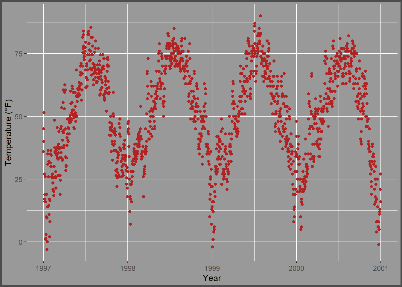
Similarly, to change the background color (fill) of the plot area, you can modify the theme element plot.background using the theme() function. This allows you to customize the appearance of the entire plot area according to your preferences.
ggplot(chic, aes(x = date, y = temp)) +
  geom_point(color = "firebrick") +
  labs(x = "Year", y = "Temperature (°F)") +
  theme(plot.background = element_rect(fill = "gray60",
                                       color = "gray30", linewidth = 2))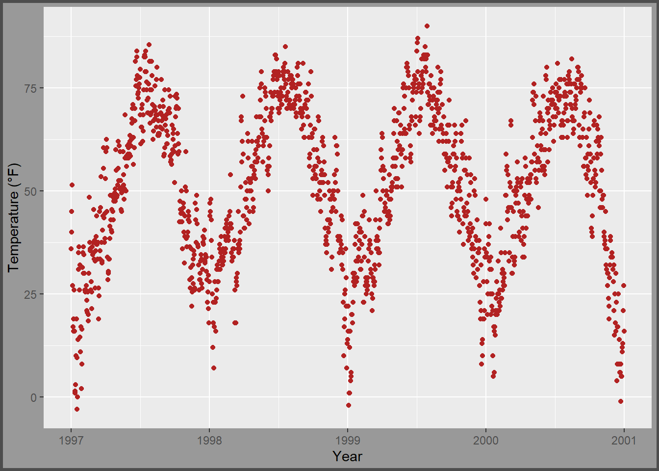
You can achieve a unique background color by either setting the same colors in both panel.background and plot.background or by setting the background filling of the panel to "transparent" or NA. This customization can help you create visually appealing plots that match your design preferences.
ggplot(chic, aes(x = date, y = temp)) +
  geom_point(color = "firebrick") +
  labs(x = "Year", y = "Temperature (°F)") +
  theme(panel.background = element_rect(fill = NA),
        plot.background = element_rect(fill = "gray60",
                                       color = "gray30", linewidth = 2))