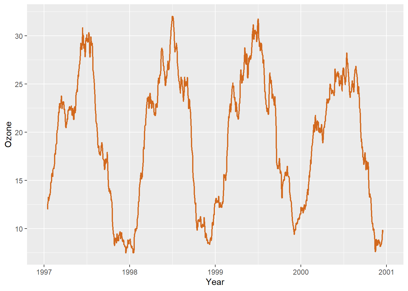
This is not a perfect dataset for demonstrating this, but using ribbon can be useful. In this example we will create a 30-day running average using the filter() function so that our ribbon is not too noisy.
$ o3run <- as.numeric (stats:: filter (chic$ o3, rep (1 / 30 , 30 ), sides = 2 ))ggplot (chic, aes (x = date, y = o3run)) + geom_line (color = "chocolate" , lwd = .8 ) + labs (x = "Year" , y = "Ozone" )
Warning: Removed 29 rows containing missing values or values outside the scale range
(`geom_line()`).
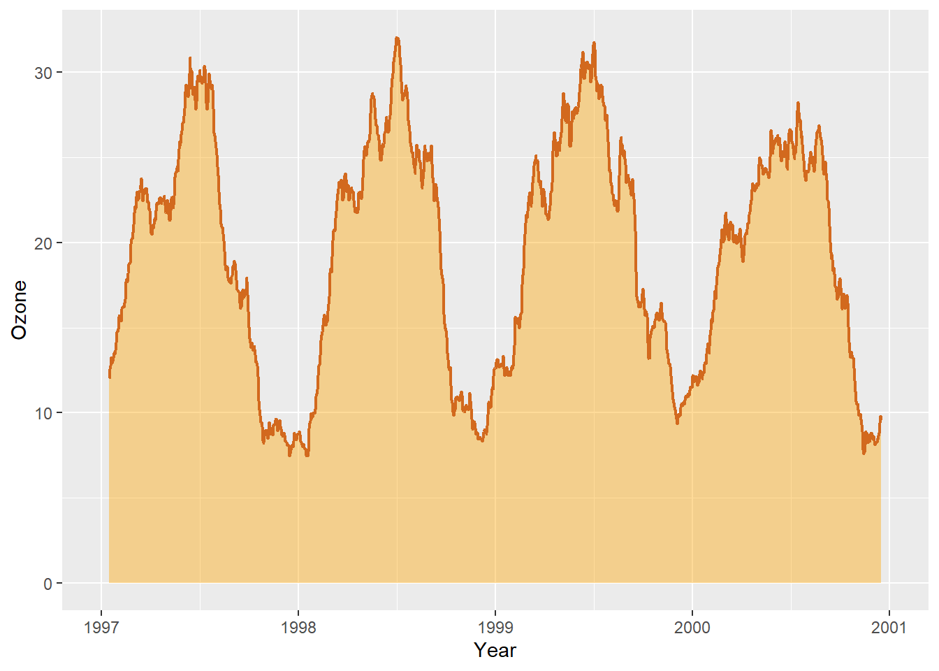
How does it look if we fill in the area below the curve using the geom_ribbon() function?
ggplot (chic, aes (x = date, y = o3run)) + geom_ribbon (aes (ymin = 0 , ymax = o3run),fill = "orange" , alpha = .4 ) + geom_line (color = "chocolate" , lwd = .8 ) + labs (x = "Year" , y = "Ozone" )
Warning: Removed 29 rows containing missing values or values outside the scale range
(`geom_line()`).
Nice to indicate the area under the curve (AUC) but this is not the conventional way to use geom_ribbon().
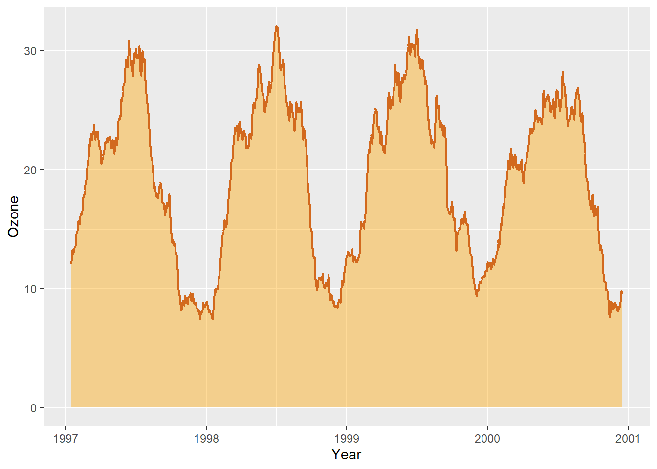
Actually a nicer way to achieve the same is geom_area().
ggplot (chic, aes (x = date, y = o3run)) + geom_area (color = "chocolate" , lwd = .8 ,fill = "orange" , alpha = .4 ) + labs (x = "Year" , y = "Ozone" )
Warning: Removed 29 rows containing non-finite outside the scale range
(`stat_align()`).
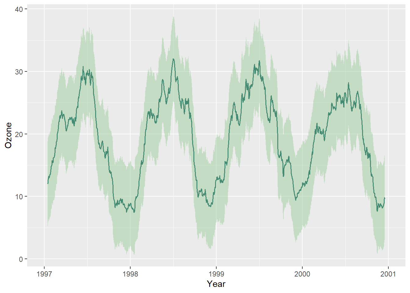
Instead, we draw a ribbon that gives us one standard deviation above and below our data:
$ mino3 <- chic$ o3run - sd (chic$ o3run, na.rm = TRUE )$ maxo3 <- chic$ o3run + sd (chic$ o3run, na.rm = TRUE )ggplot (chic, aes (x = date, y = o3run)) + geom_ribbon (aes (ymin = mino3, ymax = maxo3), alpha = .5 ,fill = "darkseagreen3" , color = "transparent" ) + geom_line (color = "aquamarine4" , lwd = .7 ) + labs (x = "Year" , y = "Ozone" )
Warning: Removed 29 rows containing missing values or values outside the scale range
(`geom_line()`).